New campus map combines cartography know-how, best of web
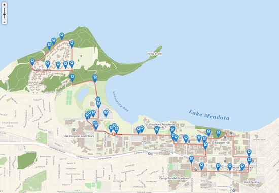
The map has a number of innovative features including one that shows stops on selected bus routes. By clicking on the stop icons, bus riders can get real-time arrival data.
One of the most frequently used campus online tools, UW–Madison’s campus map, recently received a facelift at http://map.wisc.edu.
In addition to a brand-new look and smooth functionality, the site includes real-time Madison Metro data and also works on smart phones and tablets.
But, beyond the basics, the map represents a collaboration between University Communications and Marketing and the deep tradition of cartography on campus.
“There’s a lot about this project that really is at the cutting edge of web map technology,” says Nick Weaver, director of web services in University Communications and Marketing. “We were proud to push these tools while keeping mindful of best practices in cartographic and web design.”
“The previous campus map was celebrated for its beauty. I hope to see the new map celebrated for its innovation.”
Tanya Buckingham
The site is highly used by students, faculty and staff and campus visitors, averaging 500,000 viewers per year and is deemed one of the most important websites on campus.
The old map, launched in 2006, was highly-regarded in its time and was often noted as one of the top campus maps in the country. But it was built using Flash, which made it unusable on iPhones and iPads and other mobile devices. It was also difficult to maintain and update.
To overhaul the map, University Communications and Marketing consulted regularly with staff and graduate students in UW’s Cartography Lab and sought to incorporate new web-mapping tools.
The new map represents a philosophical shift, with cartographers and programmers working together to create a product with new functionality while making well-informed cartographic decisions, says says Tanya Buckingham, assistant director of the UW Cartography Lab.
“There is no better place to take a risk in replacing a highly celebrated map, than an institution like UW–Madison, which has a deep history of cartographic tradition,” she adds. “Both to challenge the technological changes occurring, and to actively push them forward, influencing how we would like to see these tools evolve.”
Buckingham says that the demands of users were carefully balanced with design an aesthetic considerations.
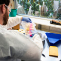
OpenStreetMap, the “Wikipedia” of map data, was used as the foundation for campus data. Although data isn’t read directly from OSM, tapping into that massive community data project provided a solid starting point for mapping the campus. Web developer Bryan Shelton combined this with data from the old map, as well as input from FP&M.
Because of the new map’s data-driven design, it’s much easier to make updates and corrections and there can also be improvements in campus data, with input from the community.
Adding Metro bus data into the map was a natural fit, says Shelton, as that information is already incorporated into the Mobile UW app. The overlay shows where campus routes run and when buses are arriving at each stop and can be used to track Metro buses all over Madison.
The map also includes real-time data about the Madison B-Cycle program. Users can see how many bikes or open bike slots are available at each B-Cycle location around town. B-Cycle is shut down for the season, and the feature will be available when warmer weather returns.
The map will also show real-time, available visitor parking spaces in 10 campus parking ramps and garages.
In coming months, Shelton and Weaver hope to add richer data, including better parking info and additional details about map locations, such a hours of operation, and possibly even Instagram photos generated by users.
“The previous campus map was celebrated for its beauty,” says Buckingham. “I hope to see the new map celebrated for its innovation.”
Tags: cartography
-
UW–Madison’s reach throughout Wisconsin adds up to $38.9 billion a year
The university supports more than 287,000 jobs and helps drive private-sector growth.
-
‘Being part of something bigger than you’ with Badger Volunteers
UW–Madison students head into the local community to find purpose and make a difference.
-
UW–Madison again named a ‘new Ivy’ by Forbes
The university was selected as one of the best in the country at "preparing and graduating the talent" that meets today's workforce needs.
-
UW–Madison graduate programs ranked among the nation’s best by U.S. News
Nearly 20 programs ranked in their respective Top 10 lists, shining a light on the breadth and depth of the university’s graduate offerings.